Posts

Showing posts from March, 2025

Degree Project: Hospital Level + Checkpoint Bug Fixes

Image
  This is the blueprint for the checkpoints, which I made recently. Until recently if the player died without touching a checkpoint or restarted the level it would spawn them at coordinates (0, 0, 0) in the void really far away from the level. To circumvent this, I added a new  boolean variable called HasHitCheckpoint? Which is attached to the player. It is activated with the rest of the checkpoint blueprint to become true when the player interacts with it. This aforementioned Boolean is then set as the condition for the True/ False branch node on this graph, which is the player respawn function. if the Player has hit the checkpoint, it respawns the player at its exact coordinates, if false it just restarts the level. This capsule will be in a room where the computer incharge of the simulation in the narrative will explain what the hemispheres were truly all about (repairing coordination and the nervous system) These are just some decorative doors for the hospital level I thin...

Degree Project Inspirations: James Turrell

Image
James Turrell     Turrell, J. (1992).  Space that sees .  Sculpture/ Installation Today  Steve introduced me to this Artist, James Turrell, during my tutorial. After comparing my opening level to one  of his pieces I really cannot unsee it. I may use some of his other works as inspiration for levels just because of how similar it is already to the aesthetic that I'm going with.              James Turrell    www.wikiart.org . Available at: https://www.wikiart.org/en/james-turrell/ (Accessed: 19 March 2025).

Degree Project: Level 2.5 and Menus

Image
 Today I started on Interlude Level 2, which is placed between the maze and Lava Levels. The whole idea of this level is that there are 4 exits and each one is just a short walk down a corridor. The platforming challenges are made to be especially difficult because of the level length and the gimmick, which is you cannot die, rather just fall onto lower levels. This means that, yes, you can beat this level really quickly and there's much less challenge but that's what I wanted to go for with the Interlude Levels. The player also doesn't know that if they repeatedly fail to cross the platforms they can still leave the level. I also worked on the main menus for the game a little, adding backgrounds. I made these images in a custom level with 2 glowing spheres on a night sky background. a much better background than a blank white screen. Though these are not final, they're much closer to what I want. I also think the roboto light typeface fit much better than that the bold...

Showreel 1

2 of Us · Emil Axelsson Coast 2 Coast P. Epidemic Sound Released on: 2017-01-20 Composer: Emil Axelsson Music Publisher: Emil Axelsson Blank letter head

Degree Project: Level 1.5

Image
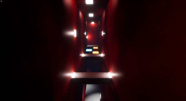
Here are some screenshots of one of the Interlude Levels from my game. As previously mentioned, these are primarily for adding to the story through text exposition with the various TVs throughout the levels. The layout of the level is a short corridor which transitions to a large hall area where the player must ascend to the top through less difficult, platforming challenges and no threat of death. The whole level uses the Twin peaks Red Room aesthetic as this is meantto be a 'loss of control in the simulation' dream sequence type thing.  Fun-fact: Did you know the chandelier is actually 3 of the default unreal engine  Table models merged together and dissasembled with a custom light source placed in the centre? Cool right? Jay reccomended when I showed him the maze level I should add a 'Pivot' mechanic which turns the player 180 degrees when they press 'F'. This is a very rudimentary blueprint of course without a proper input set-up and no turning animation. I ...

Professional Practices: Homepage Update

Image
  Today I created a scrolling gallery for my homepage as I didn'r really know what else to put there. I think the images are kind of nice, they can just be slotted in and out outh though because of how it is coded. Speaking of Code, this is the tutorial I used  https://www.youtube.com/watch?v=KCunS8KzyQ0  from here:  https://www.insidethesquare.co/squarespace-tutorials/horizontal-scrolling-images I have also started gathering footage from all of my games for the portfolio and the showreel.

Degree Project: All Main Levels playable + Lava Level Test Footage

Image
  This is a Bird's Eye-view of the complete third level, minus some small tweaks. The purple rings you can see are a branching path to the end of the level that deviates from the mian path. The whole idea of that section is the platforms being on a timer, which adds a different sense of jeopardy to the slower, more methodical main route to the top. I also made this Bridge model to add a little more visual flavour to the level. I then got the idea to use the bridge model for some of the disappearing platforms, which I think looks amazing. Too bad i came up with this idea so late in development. I really think it would've made previous levels much more interesting. Here is the Level exit to the Final Sequence of the Game. Here is some test footage of the the playable level in one run through. Some bits are still incomplete and need tweaking but it is fully playable beginning to end now.

Professional Practices: Embossed Text test + Updated Branding Templates

Image
  Ever since I saw the engraved text effect on dean's Website I wanted to see if I could do it for myself, so I tried it out in photoshop using the Bevel and Emboss tool and here is what I got. pretty cool, right? Also here are some updated branding pack materials with the new logo. I'm not sure how but they still need some work I think.

Professional Practices - Logo Redesign + Squarespace

Image
  This is my Squarespace site, which I finally bought the Subscription and Domain for today, being spgames.uk, solely because that's what the domain is on all my branding and is the name of my instagram. A majority of the text I want is in position now I just need to gather images and videos to use alongside them: A picture of myself maybe, a video of all of my works, maybe some screenshots and that should be enough. I also need to consider what I will add to my homepage too as it feels a little barren. You can also notice I changed my Logo again, for the final time hopefully, to this: The original SP games logo was too "Old Timer" and didn't really fit what I was doing so I updated it to something sleeker. It kind of feels like a 1970s Videotape company logo but it is by far the best I have done so far. Here is an older design:  This is the only previous iteration that I have left of this design because the otghers annoyed me so much I deleted them haha.